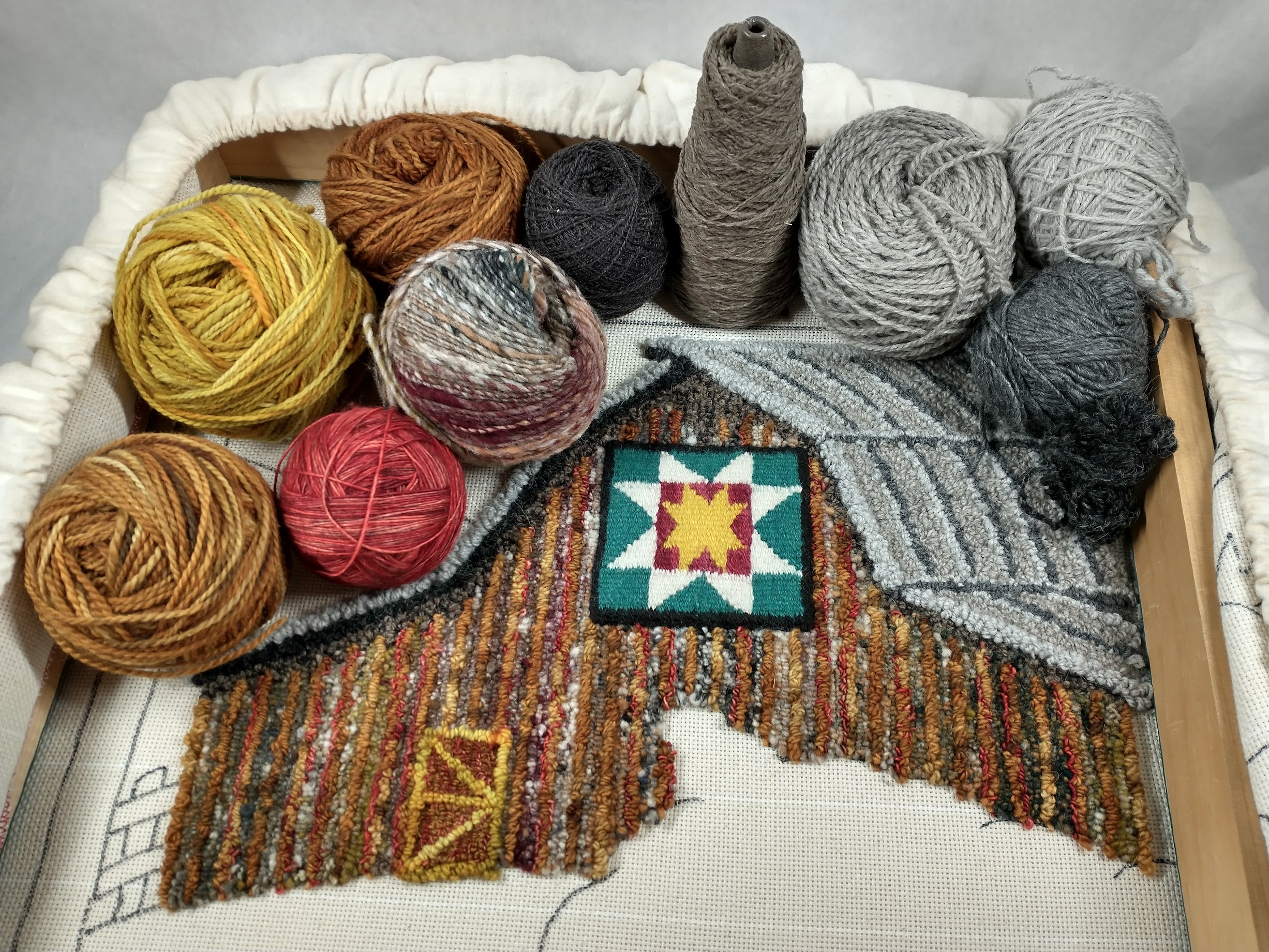
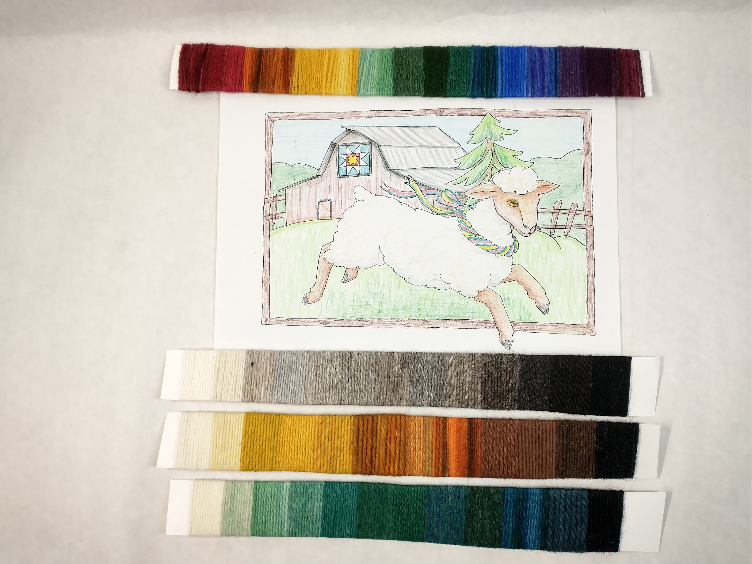
This month, I’ve been deep into the writing process of part 4 of my design course: Colo r Fluency. Here is a snippet of that work I wanted to share with you.
The common focus on teaching color as theory can leave the creative mind feeling like they’ve been handed a whole bunch of rules they now have to follow. Do this, don’t do that, NEVER do this other thing. That is the opposite of what should happen for designing minds. Learning should be door-opening, not door-closing.
You can study color forever, but it’s not the same as putting color into practice. Study is important, as it will inform your work, but your work is where you will really learn color. You need to use it, to build a relationship with it.
In writing, we acknowledge that the new writer will borrow the voice of her author heroes until she finds her own. You may find this approach equally helpful with color. Take an artist’s work you admire, really study how they are using color, then apply what you see to what you are making. How does it feel to walk a mile in their color shoes? How does this resonate with you?
Collect colors that speak to you in the materials that you use in your making process. Notice the colors in your wardrobe. Notice the colors in your home. Notice the colors in nature that call out to you. Also notice which colors bother you and why. Avocado green is not my thing—it’s too muddy and reminds me of the old stove in the farmhouse kitchen we were all so happy to retire when the burners quit working.
Practice coloring your design concept in different ways. I’ll often make several photocopies of a design and then sit down with colored pencils and try out ideas. I have a whole shoebox of colored pencils I’ve accumulated since grade school. They’re of varying degrees of quality, but the nuanced options and variety of colors gives me breather space to play and experiment. If the experiment wasn’t what I wanted—big deal, it’s a piece of paper! And a copy at that!
Just like drawing, using color becomes easier with practice. As workers of color, we try things, study the results, then adapt with our next piece. Sometimes what we were certain would work didn’t play as well as we thought it would with its neighboring colors, and other times we’re surprised by something that really did work out. And truth is in the eye of the beholder, as one arrangement of colors might feel jarring to you but is the next person’s total happy place. There really can be room for everyone.
 That being said, no color choice will make everyone happy. Someone looking at your piece just won’t like yellow or takes issue with certain combinations because of cultural influence or past trauma. You aren’t responsible for everyone or their response to your choices in color. You are responsible for being true to the intent of your design and doing your best to bring it to life in the colors that feel best to you, in that moment.
You are not your art. Your art becomes a snapshot of what you were chasing at that time, with the understanding and desires of that moment in your life. You can grow and change and chase other things. Artists who lock too solidly in a certain “look” must, I would think, eventually find that rather confining and boring. Refuse to be defined by previous experiments. Keep experimenting!
Even though we live in a materials-plentiful society, sometimes you can’t find that color you really wanted—that illusive brick red you have in your mind’s eye. Sometimes you have to go with what you have, which can be a fun challenge in itself.
As you experiment, remember not to take yourself too seriously, and that we all learn better when we’re being playful.
The course launches Oct 27. You can learn more about it here.
