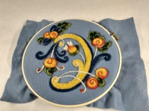
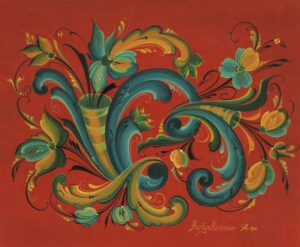
 In November 2018, I was a student at North House Folk School in Grand Marais, MN, taking a multi-day course on millenary (find that full story here). We were stationed in Blue House, in the smaller of the two rooms. Next to us was a large rosemaling class, with the tables formed in a wide U-shape to accommodate everyone’s projects. During lunch breaks, I would wander into the sunlight-filled space to admire what students and instructors were creating–from studies on paper to full-blown projects on wooden plates, panels, or key racks.
To me, the carefully wrought curving lines looked like a painting form of decorative calligraphy, with its attention to the shape and angle of the brush and the amount of pressure applied. I had worked with paint in acrylics and oils throughout my art training enough to appreciate the skill involved in the stylized scrolls, leaves, and flowers. Brushes dipped in more than one color looked fascinating, and here, like calligraphy, adherence to form and traditional also melded with the maker’s own taste and style. It was a visual conversation with the past manifest in the present.
At the time, I certainly had no idea that rosemaling was going to come to my own practice as a fiber artist. Perhaps, however, there is a natural lineage between the Swedish side of my heritage, my childhood propensity for doodling scrolling floral patterns into the margins of notebooks, and my developing repertoire of “painting with wool” needle felting projects and kits–a meeting of mediums meant to happen.
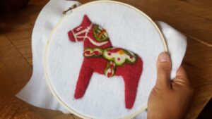 It began with a request from a North House student for a needle felted Dala Horse project, which launched me on a mini research project to learn about the story of Dala Horses and rosemaling as a greater art form. I loved finding tales of the Nordic version of lumberjacks carving small wooden horses to bring home to their children on the farms and villages at the end of the timbering season as the humble beginnings of the Dala Horse. I, too, had prized my own childhood collection of miniature horses, though they were not of the hand-carved sort.
But the internet-wide assertion that rosemaling comes from the Baroque decorative arts interpreted through guilds and then the folk arts lens felt less nuanced to me. As a medievalist and ancient histories enthusiast, I saw the long fingers of this artform stretching even further back and across European cultures–connected deeply by trade and the migration of people and iconography throughout all these periods.
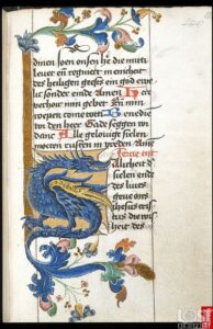 I finally put my finger on it when discussing my latest project with Patti Goke, rosemaling gold medalist and instructor for Vesterheim Folk Arts School. “It feels like manuscript illuminations!” I exclaimed, thinking on those carefully crafted borders and head lettering with its scrolls and vines, flowers and adornments that added to the massive expense of bookmaking at the time. Even the same colors are shared–a keen love of blues, reds, greens, and goldens.
The scrolling motifs in medieval illuminations can be found in similar form in Greco-Roman mosaic floors, showing just how concepts inspired by nature become recycled and re-interpreted with each generation. It also speaks to how enduring these floral, scrolling motifs are to human consciousness and our desire to beautify our spaces–whether as large as a room or as small as a book or a plate. Especially where winter prevails half or more of the year, the desire to add color and the flowers of spring and summertime to one’s living quarters run deep–perhaps even as deep as the oldest symbol of all–the spiral of creation and regeneration.
But now that we have walked rosemaling all the way back in art history, let’s return to the present and my needle felting practice. After the release of the Dala Horse project, Kirsten of Marine Mills Folk School requested a painting with wool project for February with a Swedish heart theme. She sent me pictures of favorite colorwork mitten patterns, and I sent her images from embroidery, and eventually a traditional design was selected as inspiration for the project. But the original colors seemed loud, with a strong emphasis on orange (not my favorite color), as well as primary colors.
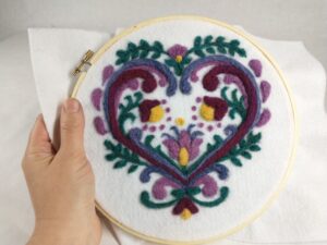 Instead of these loud, competing colors, I drew on a subtler, more Erindale Tapestry Studio style palate with heathered tones of teal, lavender, burgundy, rose, and sunshine. The symmetry of the design speaks of harmony, while the verdant leafy vines and flowers remind me of the motifs on family hope chests brought over from the Old Country. It was a perfect Valentine’s project with a heartwarming twist.
Seeing this project inspired Josh of Vesterheim Folk Arts School to request a themed class of their own–this time inspired by rosemaled pieces from their historic collection. He sent me a variety of images of plates from different eras and regions of Norway as inspiration. After thoughtfully sitting with these colorful pieces for a few days, I knew it was time to consult a subject matter expert and reached out to Patti Goke.
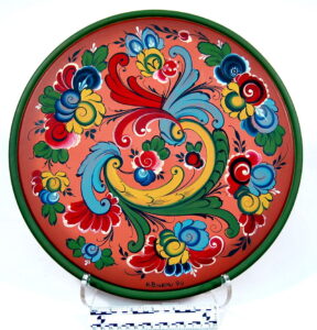
“I feel like I’m being asked to represent another art form,” I shared with her over the phone. “And I don’t want it to look like bad plagiarism. I want to do the medium justice.”
 She laughed, offered, “I get it,” and off we dove into our exciting collaboration.
Studying the historical pieces, we discussed what would and what would not work in a painting with wool needle felting project. Patti had taken one of my Dala Horse felting classes, so it helped that she had experienced the process as well. We both knew right away that the designs would have to be simplified.
“I’m looking for a strong central motif and a sense of movement. But when I look at these pieces, I don’t know which elements are essential and which are decorative,” I relayed as we compared the plates and narrowed down on two that spoke to us. “That’s where your expertise would be so helpful.”
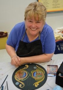
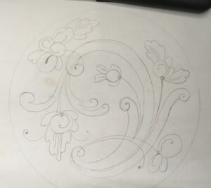
“Tell you what,” Patti concluded near the end of our conversation, “I’ll put together a sketch, then you start to play with it.”
When I work on tapestry cartoons, I think about the “weavability” of a particular image. There are constraints within the medium that make certain elements highly workable while others become nearly impossible. For this design, I was considering feltability within the constraints of an 8-inch circle, which is the size of the embroidery hoop I use for student painting with wool projects. To start, I traced along the inside of an embroidery hoop on pieces of paper and began playing with redrawing Patti’s inspired design. I’d photograph a sketch, send it to her, she’d virtually draw on it with annotations, sending it back for a rework. I’d take another stab, and onward we went. Through this process, I began to learn how a rosemaling design thinks–which elements are primary, which are secondary; which are essential and which can be dropped without losing the design.
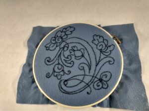 And then it was time to begin rendering the design-in-process onto a felt backing, and this is when the discussion of color arrived. Previously, my rosemaling-like projects had been on a white backing. This does not compete with the other colors and makes it easy to transfer the design by using a light table (aka Farmstead Creamery’s bakery case at night). While rosemaling is certainly alive with colors, they’re not the loud types typically available in craft felt. Originally, we thought to use a salmon-ish background like the plate we were studying, but all the options felt too much like Miss Piggy colors. Navy and Black are classic rosemaling backgrounds, but too dark of a color would mean that transferring the design would become impossible. Digging through my stash, I found squares of soft bluish-gray, and this passed Patti’s approval as a workable color.
Now for decision on the colors of the felting wool itself! “This is where you come in,” was Patti’s coaching. “Everyone brings their own sense of color. The plate we’re working from, in my mind, uses too many colors. But that’s just the way my brain is wired.”
“Are there any taboo colors?” I asked. “Like in medieval heraldry, you don’t use orange or pink.” She agreed that pink and purple would not be traditional colors, but beyond that she was letting me loose to explore the piece with my own taste.
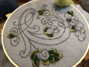 I agreed that not using too many different colors would help it visually hold together, as well as make assembling kits for the project more manageable. In a burst of creative energy that wouldn’t let me put the felting needle down, I began the wool painting process that ever so slowly brought the flat design into sculpted and colorful form. Progress pics peppered Patti’s messenger account, thrilling me with “YES!!!” and red hearts as I went.
The order in which I felted the elements was certainly not the order in which I would teach them, but in essence I was visually backing my way into the design–starting with the parts I knew instinctively and feeling my way into the less obvious color choices. Shaded greenery took the stage first, with dark and light tones mimicking the sweeps of the paint-loaded brushes. Then the blues spoke to me next, the deep navy offering contrast to the gray-blue background.
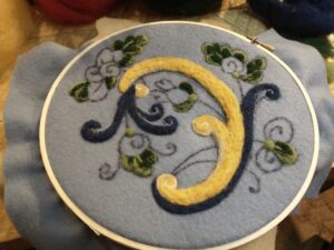 But now the piece felt dark and chilly. Time to add some warmth! Baby chick yellow and soft white answered the call, forming the primary scroll. I had to think on the execution of the flowers for a few minutes, as they could easily claim too much attention and draw the eye away from the central focus, and yet they were entirely integral to the whole and shouldn’t be understated. There was also a need for additional warmth. The yellow was helping, but it still wasn’t enough on its own.
A light touch of Dala Horse orangey red did just the trick as the cinnamon roll-style flowers came into form, highlighted by delicate white stems. The piece was coming together! And yet, as Patti and I celebrated virtually, there was still something that was missing.
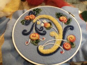
“I wonder if I could put a little more blue up the back of the scroll?” I asked Patti. “I think it might feel more balanced.” She agreed, so long as the line stayed fairly thin. After this small tweak, the piece was finished, and we were both excited about the accomplishment.
“I think you have done wonderfully! I really like the flowers,” she offered as we wrapped up our collaboration session. I was so excited about the project and the challenge it had given me in its inception and creation. How delightful this will be to share with Vesterheim students! This class is now live and available for registration. You can find all the details here.
Stay creative! ~Laura

